The Color Trends Interior Designers Are Completely Over (and What’s Replacing Them)

Chuvic - July 17, 2025
Share

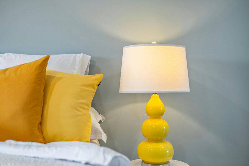
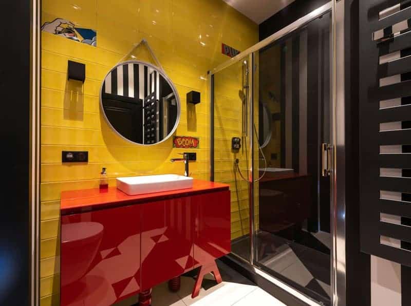
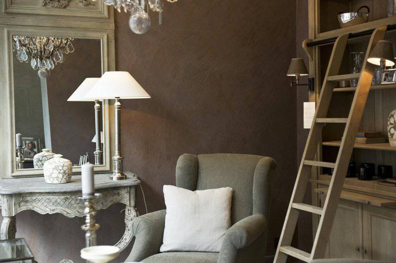
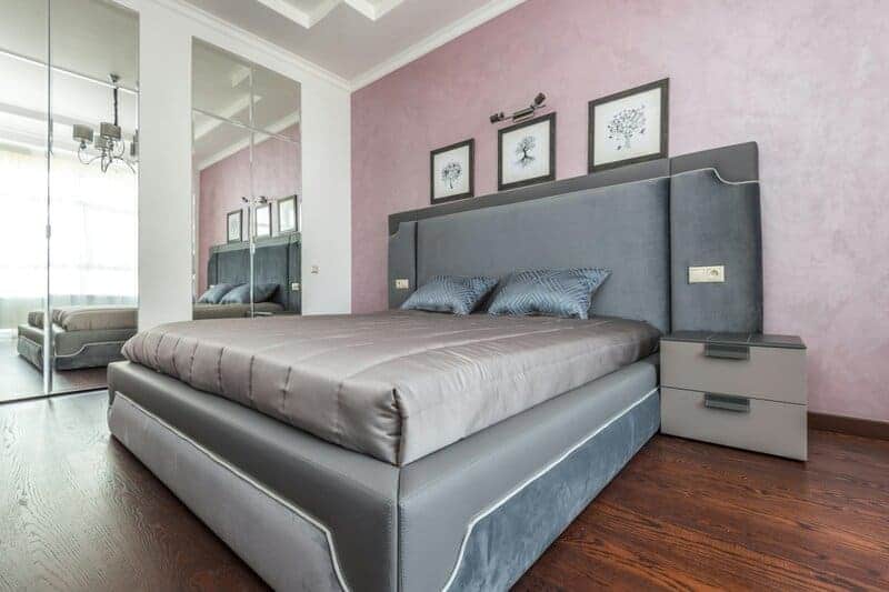
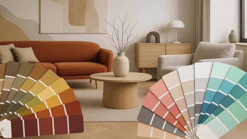
Every year, the world of interior design is refreshed with new ideas, and color is often at the forefront of these transformations. What once felt fresh can quickly start to feel outdated, leaving homeowners craving a change. Today’s leading designers are moving away from certain dated hues and gravitating towards palettes that feel more current, sophisticated, and livable. If you’re planning a makeover or simply curious about what’s next, discover which color trends are on their way out—and what’s taking their place in stylish homes everywhere.

1. Gray Everything → Warm Neutrals

1. Gray Everything → Warm Neutrals
A cozy gray living room accented with beige furnishings creates a welcoming space in a warm neutral palette. | Photo by Photo By: Kaboompics.com on Pexels

The era of monochromatic gray interiors is coming to a close. Once celebrated for their sleek, modern vibe, all-gray spaces are now seen as cold and uninspiring.
Designers are embracing warm neutrals like taupe, beige, and creamy whites, which instantly make rooms feel more inviting and versatile.
These soft shades offer a timeless backdrop that pairs well with almost any accent color or decor style, creating a sense of comfort that today’s homeowners crave. Warm neutrals are truly redefining modern coziness.

2. Cool White Walls → Soft Off-Whites

2. Cool White Walls → Soft Off-Whites
A cozy living room showcases color swatches held against a white wall and an off-white wall for comparison. | Photo by Lisa Anna on Pexels

Stark, cool white walls have fallen out of favor for their sterile, impersonal feel. Today’s designers are gravitating toward soft off-whites—think creamy ivory, antique linen, and subtle eggshell.
These hues bring a sense of depth and warmth to any room while still providing a clean, classic look.
According to House Beautiful, off-whites add coziness and make spaces feel more lived-in and approachable. The result is a welcoming atmosphere that’s both fresh and timeless.

3. Millennial Pink → Earthy Terracottas

3. Millennial Pink → Earthy Terracottas
Millennial pink accents and earthy-toned cushions pop against a warm terracotta wall, creating a cozy, modern retreat. | Photo by Jan van der Wolf on Pexels

Millennial pink once ruled Instagram feeds and designer palettes, but its reign is drawing to a close. Interior designers are now embracing earthy terracotta and clay tones for their rich, organic appeal.
These sun-baked hues evoke a sense of grounding and connection to nature, instantly making spaces feel more welcoming and authentic.
As Elle Decor highlights, these colors work beautifully with natural textures and add depth, making them a sophisticated alternative to pastel pinks.

4. Charcoal Black → Deep Greens

4. Charcoal Black → Deep Greens
A stylish green room features a bold charcoal accent wall, complemented by lush forest green decor and cozy furnishings. | Photo by Monstera Production on Pexels

Charcoal black once served as the go-to accent for dramatic, modern spaces, but its dominance is fading. Instead, designers are turning to deep, forest greens for a fresh yet timeless look.
These lush hues infuse interiors with a sense of tranquility and sophistication, echoing the calming influence of nature.
According to Architectural Digest, dark greens are versatile enough for bold statements or subtle accents, making them an inspired replacement for black in today’s homes.

5. Navy Blue → Dusty Blues

grey metal hook on blue wood plank
Source: Photo by Markus Spiske on Unsplash

Navy blue, once the darling of bold accent walls and cabinetry, is making way for dusty blues that offer a softer, more understated elegance. These muted tones evoke a sense of serenity and calm, seamlessly blending into both traditional and contemporary interiors.
As noted by Better Homes & Gardens, dusty blues are highly adaptable and pair beautifully with warm neutrals, wood, and metallics, making them a versatile choice for any room seeking a tranquil update.

6. Bright Teal → Muted Sage

Stylishly set dining table with glassware and candlesticks, perfect for a refined dinner setting.
Source: Photo by Max Vakhtbovycn on Pexels

The era of vivid teal is waning as designers embrace the subtle beauty of muted sage greens. This soothing shade brings a calming, organic vibe to interiors, making rooms feel both grounded and refreshingly modern. Muted sage is celebrated for its versatility—it works beautifully with natural materials and a variety of color palettes. According to Veranda, sage green’s timeless appeal and tranquil effect have made it a favorite for contemporary spaces looking to move beyond bold, bright hues.

7. All-Black Kitchens → Creamy Kitchens

a kitchen with a stove top oven next to a window
Source: Photo by Clay Banks on Unsplash

Moody, all-black kitchens once made a bold statement, but their starkness is now being replaced by creamy cabinetry and warm, inviting materials. Designers are opting for soft, light tones that reflect natural light and create a welcoming, timeless ambiance. This shift is highlighted by House Beautiful, which notes that creamy kitchens offer flexibility in accessorizing and pair beautifully with wood, brass, and organic textures for a space that feels both fresh and comforting.

8. Bright Yellow Accents → Mustard and Ochre

8. Bright Yellow Accents → Mustard and Ochre
Bright yellow accents and mustard-hued decor add warmth and vibrancy to this chic, ochre-inspired living space. | Photo by Curtis Adams on Pexels

The days of primary bright yellow pops are behind us. Designers are now favoring deeper, more sophisticated shades like mustard and ochre. These earthy yellows introduce warmth and a touch of retro flair while feeling grounded and modern. According to MyDomaine, mustard and ochre complement a wide range of neutrals and bring a cozy, lived-in character to any space, making them a contemporary favorite for accent walls, textiles, and decor.

9. Eggplant Purple → Aubergine and Plum

red throw pillows on white bed
Source: Photo by Lotus Design N Print on Unsplash

The once-popular eggplant purple is being replaced by more refined shades of aubergine and plum. These nuanced purples offer depth and drama without dominating a room.
Aubergine and plum hues are sophisticated, pairing beautifully with both neutrals and metallics to create rich, layered interiors. As noted by House Beautiful, these colors add a subtle touch of luxury, allowing for bold expression while maintaining elegance and balance in the space.

10. Pastel Mint → Olive Green

white and brown wooden chair beside green potted plant
Source: Photo by Andrea Davis on Unsplash

Pastel mint, once a go-to for airy, playful spaces, is being overshadowed by the rise of olive green. This earthy hue is beloved by designers for its versatility and grounding presence.
Olive green works seamlessly with both warm and cool tones, bringing a sophisticated, natural vibe to any room. According to Martha Stewart, this shade’s adaptability makes it ideal for everything from accent walls to kitchen cabinetry, adding depth without overpowering a space.

11. Bright Red → Burnt Sienna

11. Bright Red → Burnt Sienna
A vibrant red wall sets the stage for burnt sienna decor, creating a cozy atmosphere of earthy reds and warmth. | Photo by Max Vakhtbovycn on Pexels

The days of vivid, primary reds dominating interiors have passed. Designers now prefer the earthy elegance of burnt sienna and rich brick tones.
These warm hues evoke comfort and sophistication, adding a sense of history and depth to modern spaces. As highlighted by Architectural Digest, burnt sienna pairs beautifully with wood, leather, and natural textures, making it a refined and approachable option for those seeking a bold yet inviting color statement.

12. Ice Blue → Slate Blue

A room with a blue floor and a white wall
Source: Photo by Steve Johnson on Unsplash

The cool, almost frosty look of ice blue is falling out of favor as designers opt for the depth and sophistication of slate blue. This muted, steely blue offers a refined alternative, bringing a calm yet contemporary feel to modern interiors. As noted by House Beautiful, slate blue is highly adaptable, pairing effortlessly with neutrals, wood tones, and metallics, making it a versatile choice for walls, cabinetry, and accents alike.

13. Neon Accents → Muted Jewel Tones

color scheme illustration
Source: Photo by Will on Unsplash

The once-trendy neon accents are now considered too harsh and fleeting for most interiors. Designers are embracing muted jewel tones—think sapphire, emerald, and ruby—for a look that’s both bold and sophisticated. These rich hues add depth and a sense of luxury without overwhelming a space.
According to Elle Decor, muted jewel tones provide an elegant pop of color that feels timeless, making them perfect for everything from upholstery to wall paint.

14. Chocolate Brown → Walnut and Mocha

brown wooden chairs, table, and cabinet
Source: Photo by Fujiphilm on Unsplash

The dominance of heavy chocolate brown tones is fading, making room for lighter, more nuanced shades like walnut and mocha. These updated browns feel fresher and more modern, lending warmth without the visual weight of their darker predecessors. As highlighted by Homes & Gardens, walnut and mocha shades work beautifully in both furniture and wall colors, offering a versatile, inviting palette that complements contemporary and classic spaces alike.

15. Red-Based Beiges → Greige

15. Red-Based Beiges → Greige
A stylish living room showcases the subtle contrast between beige and greige walls, highlighting today’s favorite neutral color trends. | Photo by Pixabay on Pexels

The once-popular red-based beige walls are giving way to the subtle sophistication of greige, a modern blend of gray and beige. Greige offers a cooler, more balanced alternative that feels both fresh and timeless, making it ideal for contemporary interiors. According to MyDomaine, this versatile hue pairs effortlessly with a wide range of colors and finishes, serving as a perfect neutral backdrop for everything from minimalist decor to bold accents.

16. Orange Tangerine → Rust

16. Orange Tangerine → Rust
A cozy living room pops with tangerine decor and rust accents, embracing this season’s vibrant orange color trends. | Photo by Jan van der Wolf on Pexels

The vivid energy of orange tangerine accents has given way to the depth and subtlety of rust tones in today’s interiors.
Rust offers a richer, earthier alternative, blending seamlessly with popular neutral and natural palettes.
As highlighted by Elle Decor, rust tones bring warmth and sophistication to any space, making them a favorite for everything from textiles and accent walls to decor, especially in homes embracing organic and modern aesthetics.

17. Lime Green → Moss Green

a room filled with lots of windows and green chairs
Source: Photo by Sy on Unsplash

The once-popular lime green is fading from interior trends, replaced by the calming allure of moss green.
This serene, nature-inspired shade brings a grounded, organic feel to modern homes, echoing the current desire for tranquility and connection to the outdoors.
As House Beautiful notes, moss green pairs beautifully with natural materials and earthy tones, making it an ideal choice for everything from living rooms to bedrooms.

18. Pale Lavender → Dusty Mauve

18. Pale Lavender → Dusty Mauve
Soft lavender accents and plush furnishings bring a dreamy touch to a dusty mauve room, embracing the mauve color trend. | Photo by Max Vakhtbovycn on Pexels

The delicate look of pale lavender is giving way to the richer, more sophisticated tones of dusty mauve.
This muted shade offers a perfect blend of subtlety and vintage romance, bringing a soft, layered depth to interiors.
As highlighted by Architectural Digest, dusty mauve works beautifully with both neutrals and metallics, creating a timeless and inviting atmosphere ideal for bedrooms, living rooms, and accent pieces.

19. Stark Black-and-White Contrast → Soft Monochromes

19. Stark Black-and-White Contrast → Soft Monochromes
A serene monochrome room features sleek black and white furnishings, softened by a gentle, understated color palette. | Photo by Ricky Esquivel on Pexels

The bold, high-contrast black-and-white look is giving way to softer, more harmonious monochrome palettes.
Designers are now layering various shades of warm neutrals—creams, beiges, and gentle taupes—to create depth without harsh edges.
According to Veranda, these soft monochromes evoke a sense of calm and cohesion, making rooms feel more inviting and effortlessly sophisticated while still maintaining visual interest and style.

20. Primary Blue → Cerulean

20. Primary Blue → Cerulean
A striking primary blue wall sets the scene, accented by cerulean decor that celebrates the latest blue color trends. | Photo by wr heustis on Pexels

The classic primary blue is making way for the lighter, more invigorating shade of cerulean in today’s interiors.
Cerulean’s airy, clear tone brings a sense of freshness and optimism, brightening up spaces without overpowering them.
As noted by Architectural Digest, this blue pairs beautifully with both warm and cool accents, making it a versatile choice for walls, decor, and statement pieces in modern homes.

21. Glossy Metallics → Aged Brass & Bronze

a group of brass figurines sitting on top of a white surface
Source: Photo by Lee Young on Unsplash

The once-popular glossy silver and gold finishes are losing their luster as designers favor the understated charm of aged brass and bronze. These warm metals bring subtle elegance and a sense of history to interiors, perfectly complementing today’s organic and vintage-inspired trends. According to Elle Decor, aged brass and bronze finishes add depth and character without the flashiness of high-shine metallics, making them ideal for lighting, fixtures, and hardware.

22. All-White Bathrooms → Spa Greens and Blues

22. All-White Bathrooms → Spa Greens and Blues
A serene bathroom retreat featuring crisp white tiles, calming spa green accents, and touches of trendy blue décor. | Photo by Photo By: Kaboompics.com on Pexels

The crisp, all-white bathroom is being reimagined with soothing shades of spa-inspired greens and blues.
These tranquil hues evoke relaxation and freshness, transforming bathrooms into serene retreats.
According to House Beautiful, greens and blues not only provide a modern update but also pair beautifully with natural materials like wood and stone, creating a balanced, rejuvenating space that feels both timeless and on-trend.

23. Candy Colors → Muted Pastels

a living room filled with furniture and lots of windows
Source: Photo by Steph Wilson on Unsplash

The playful exuberance of bright candy colors is being replaced by the understated charm of muted pastels. These softer hues—think powdery blue, blush, and sage—bring a sense of calm and sophistication to interiors, making spaces feel more elegant and soothing.
As noted by Veranda, muted pastels pair effortlessly with contemporary design elements and natural textures, offering a modern, grown-up take on classic pastel palettes.

24. Gold Accents → Champagne and Pewter

24. Gold Accents → Champagne and Pewter
Luxurious gold decor and sparkling champagne accents bring warmth to a sophisticated room with a sleek pewter finish. | Photo by Vika Glitter on Pexels

The once-coveted shiny gold accents are being replaced by the subtle allure of champagne and pewter finishes. These softer metallics offer a timeless, understated elegance that blends seamlessly with both modern and traditional interiors. According to House Beautiful, champagne and pewter finishes provide a refined alternative to bright gold, creating a sophisticated backdrop for lighting, fixtures, and decorative details without overwhelming the space.

25. Bright Coral → Soft Peach

25. Bright Coral → Soft Peach
Soft coral decor accents brighten a cozy peach-toned living space, embracing the latest warm pastel interior trends. | Photo by Ron Lach on Pexels

The vibrancy of bright coral is giving way to the understated charm of soft peach in contemporary interiors.
Soft peach tones offer a gentle, sun-kissed warmth that feels inviting and fresh without overwhelming the senses.
As highlighted by Elle Decor, these hues blend beautifully with neutrals, golds, and earthy shades, making them a versatile choice for walls, textiles, and accessories in modern homes.

26. Overused Greige → Complex Warm Whites

26. Overused Greige → Complex Warm Whites
A cozy living room showcases the subtle contrast between greige and warm white walls, layered with soft neutral furnishings. | Photo by Madison Inouye on Pexels

The once-ubiquitous flat greige is being replaced by complex warm whites that offer much more depth and interest. These nuanced whites have subtle undertones—hints of cream, blush, or gold—that create a sense of dimension and amplify natural light.
According to MyDomaine, warm whites are now a designer favorite for making spaces feel airy and layered, providing the perfect backdrop for both vibrant and neutral palettes.

27. Stark Red Doorways → Deep Blue or Green

27. Stark Red Doorways → Deep Blue or Green
A vibrant entryway showcases bold red, blue, and green doors, each inviting curiosity and adding colorful charm. | Photo by Leyla Kılıç on Pexels

The iconic red front door is being reimagined as homeowners and designers opt for deep blue or green shades.
These rich colors lend a sense of sophistication and modern appeal, instantly elevating a home’s curb appeal. As noted by Better Homes & Gardens, deep blue and green doorways complement a variety of exterior finishes, providing a welcoming yet contemporary update that stands out with timeless elegance.

28. Overdone Navy Cabinets → Mushroom and Putty

brown wooden coffee table and blue armchair
Source: Photo by Francesca Tosolini on Unsplash

The popularity of navy blue cabinetry is waning as designers embrace the understated elegance of mushroom and putty hues. These nuanced neutrals bring warmth and subtle sophistication, blending effortlessly with a range of styles and color palettes. According to House Beautiful, mushroom and putty cabinets offer a fresh alternative to bold navy, creating timeless kitchens that feel both modern and inviting.

29. Statement Color Ceilings → Subtle Tint Ceilings

white ceiling with light fixture
Source: Photo by SJ 📸 on Unsplash

The era of bold, statement color ceilings is fading, giving way to the refined beauty of subtle tints overhead. Designers are now choosing barely-there blues, blushes, or warm grays that gently enhance a room’s atmosphere without overwhelming it. As Architectural Digest notes, these soft ceilings add a unique layer of interest and dimension, inviting you to look up and appreciate the details.
Embracing these modern color shifts allows your home to feel both fresh and timeless—so don’t be afraid to experiment with your palette and let your personality shine.

.article-content-img img { width: 100% }
Advertisement